
Component Library and Requirements
All images supplied to the content team should be rendered correctly and under 250 Kb size to AVOID site speed issues
PLEASE AVOID having text on images. This will ensure we meet accessibility standards.
|
Component |
Recommended minimum image size |
Required Content |
Design Example |
| Flexible Hero Banner -Top Left (consumer site only) |
1034 x 600 |
A: Banner Title |
|
| Flexible Hero Banner - Center Left (consumer site only) |
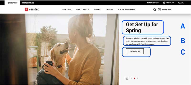
1034x600 | A: Banner Title B: Body Copy C: CTA Button copy & destination URL |
 |
| Flexible Hero Banner - Center | 1034x600 | A: Banner Title B: Body Copy C: CTA Button copy & destination URL |
 |
| Flexible Hero Banner - Top Right | 1034x600 | A: Banner Title B: Body Copy C: CTA Button copy & destination URL |
 |
| Flexible Hero Banner - Center Right | 1034x600 | A: Banner Title B: Body Copy C: CTA Button copy & destination URL |
|
| Hero image with 600p height (can also have video embedded) | 1034 X 600 px or Aspect Ratio: 5:3 |
A: Banner Title |
 |
| Video Banner to Still Image (Consumer Only Component) |
Fig 1: Video (please provide in mp4 format) Video Aspect Ratio: 16:9 or 21:9 HD (High Definition) 720p 1280x720 Fig 2: Image Resolution must be 1034x600 |
A: Banner Title: 12-25 characters max C: Button Text: 15 characters max |
Fig 1: Fig 2: |
| Logos on header navigation | 24px in Height | A: Any new logo should be 24px in Height or have an invisible rectangle box of 24px in Height. Perficient set horizontal spacing to 32px between the logos. |
 |


|
Component |
Recommended minimum image size |
Design Example |
| Product Family Section | Right Image:
1500px x 1333px (transparent background) or aspect ratio of 5:4.4 |

|
| Featured Image (Left or Right aligned) |
2037 x
1146px or aspect ratio of 2:1 |
 |
| 2 Column Image Highlight |
1086 x 724px or aspect ratio of 3:2 |
 |
| 3 Column Product Highlight |
(SKUs required, as image and description provided via pim sku) |
 |
| Two Up Slider |
Product Image:
948 x 903px or aspect ratio of 1:1 |

|
| High Res Thumbnail Images for download | Image size: 192x 128 pix |
 |
| Works with Alexa Icon in Banner (if possible, provide
with curved edges) |
474px x
144px or aspect ratio of 4:1.2 |

|
| Corporate Highlight Slick Slider -
4 Panels |
Highlight Images:
490 x 250px or aspect ratio of 2:1 |

|
| Leadership Slick Slider - 4 Panels |
Highlight Images:
360 x 260px or aspect ratio of 7:5 |

|
| Wide Image Highlight Wrapper |
Left Image: 450 x
724 or aspect ratio of 5:8 |

|
| Image Highlight Tabset | Image: 625w x 408h |  |
| 3 Column Section Hero Flex | Image: 1290 x 903 or aspect ratio of 3:2 |
 |
| Offset Slider (image left or right) |
2460 x
2016px or aspect ratio of 5:4 |

|
| Content Slider Static Video Image - 2
Panels |
3238 x
1208px or aspect ratio of 3:1 |

|
| 3 Product Image Section | Images: 1280x1280p |  |
| Leave it to Pros |
1333px x
1750px or aspect ratio of 3:4 |

|
| 2 Column Training Highlight | Image: 1800 x 1800px |
 |
| Supported Products |
Image fed in from PIM | 
|
| Video feed in (with scrolling) |
Video image fed in by video thumbnail specified on YouTube | 
|
| 3 Column YouTube Videos | Video image fed in by video thumbnail specified on YouTube |  |
| Horizontal Tabset w/copy (can be used without header and body copy) |
SKUs needed to pull product image from PIM |
With Copy
Without Copy
|
| Comparison Table | (SKUs required in order to show images.) |  |
| Horizontal Tabset with Image and Copy |
4001x1542 px or aspect ratio of 2.6:1 |
 |
| Horizontal Tabset with Interactive Home - w/icons |
OVERVIEW The image provided must be a composite of the home and the icons, and icon key/legend. Icons must be placed atop the area which they reference. URLs must be provided for each icon. IMAGE 1349w x 545h |
 |
| Horizontal Tabset with Interactive Home -w/cards |
OVERVIEW The "Supported Home" component allows front end users to click on pins that display information. The pins display on an image and are moveable by content authors. The information of the pins is displayed as a "card" and can feature a CTA that directs users or toggles the card to a new card for more information. Typically, the pins will display a product on the first card and an associated app on the second card. Users can toggle between both cards with buttons and text. There is a max of 6 pins available and they may be placed with an x and y coordinate that correlates to percentages of the image on each axis. IMAGES Background images are set per Interactive Card. The example below shows it built within a tab set but it can be a single card on a page if desired. The background images should be under 250kb in file size and the resolution should be 815 x 533px. The images for the cards (product/app) should also be under 250kb in file size. CSS will resize the images to be small - with a max width of 50px. The recommended image resolution is a minimum of 50px width for images - the aspect ratio won't be affected. CARD TOGGLES For content authors to toggle between each card, there is a tab on the right. This correlates to whatever pin is selected. To link from one card to another (maximum of 2) on a single pin, content authors must set a hyperlink or button link to "#toggle", "#back", or "#next". Any of these will link the user to the other card. Typically the first card will be a product and the second card will be related mobile app content. |
 |
| Product Hero Wrapper - On Demand Block Title | a. Background Image: 4320 x 1080px or aspect ratio of 4.3:1 b. Center Product Image: 890 x 911px (transparant background) or aspect ratio of 1:1 |
 |
| Wide Highlight Wrapper | a. Left Product Image: 450 x 724px or aspect ratio of 3:5 (with transparant background) |
 |
| Block Highlight Title Wrapper - Blue Block Title |
a. Right
or aspect ratio of 1:2 |
 |
| Hero Block Wrapper | Background Image: 3240 x 2400px or aspect ratio of 4:3 Section Hero Background Image: 3240 x 2400px or aspect ratio of 4:3 |
 |
| Offset Hero Wrapper | Right Image: 2769 x 1758px or aspect ratio of 5:3 |
 |
| Hero Contained | 1995 x 1515px or aspect ratio of 4:3 |
 |
| PDP Dark Background Overview | Image: 503w x 680h |
 |
| Retailers Style Box | Button Images: 109 x 87px or aspect ratio of 5:4 |
 |
| Widescreen Image | Background Image: 2592 x 900px or aspect ratio of 5:2 |
 |
| Product Card | a. Air Icon: 80 x 80px
b. Air Image: 933 x 933px Security Icon: 80 x 80px Security Image: 933 x 933px Water Icon: 80 x 80px Water Image: 933 x 933px *NOTE* Energy Icon: 26 x 34px Energy Image: 933 x 933px |
 |
| Image Right Contact Links | Image: 2073 x 1026px or aspect ratio of 2:1 |
 |
| Tall Banner Image (463px Height) | Banner Image: 2360 x 420px
(This banner has a height of 463 pixels. It will position the image to the top of the Stripe) or aspect ratio of 6:1 |
 |
| Short Banner Image (351px Height) | Banner Image: 2360 x 575px
(This banner has a height of 351 pixels. It will center the image) or aspect ratio of 6:1 |
 |
| Corporate Business Details (Available with copy on left or right side) |
Image Logo: 250 x 130px
or aspect ratio of 2:1 Component Image: 750x320 or aspect ratio of 2.5:1 |
 |
| Center Images | Centered Images: 290 x 260px or aspect ratio of 6:5 |
 |
| Eight Up Desktop Two Up Mobile | Highlight Images are resized by component (100p x 100p) |  |
| Six Up Desktop Two Up Mobile |
Highlight Images are resized by component (100p x 100p) |
 |
| Get The App Stripe | Left Button Image: 474 x 144px
Right Button Image: 474 x 144px or aspect ratio of 3:1 |
 |
| Block Well Highlights | First Highlight Image: 2560 x 2560px Second Highlight Image: 1280 x 1280px Third Highlight Image: 2560 x 2560px Fourth Highlight Image: 1280 x 1280px Fifth Highlight Image: 1280 x 1280px Sixth Highlight Image: 1280 x 1280px or aspect ratio of 1:1 |
 |
| Resources Highlights |
Highlight Image: 720 x 357px or aspect ratio of 3:1 |
 |


|
Component |
Recommended minimum image size |
Design Example |
| Highlight Hero Slider | Icon Image: 405 x 405px or aspect ratio of 1:1 |
 |
| Highlight Card Mobile Only Slider |
Highlight Icons: 260 x 340 px or aspect ratio of 5:7. |
 |
| Highlight Hero Mobile Only Slider | Highlight Icons: 300 x 300px or aspect ratio of 1:1 |
 |
| Six Up Wrapper | Highlight Icons: 300 x 300px or aspect ratio of 1:1 |
 |
| Partner Card | Image: 720x390 |
 |
| Logo Image Wrapper |
Image Icons: 400 x 100px |
 |
| Support Category Selector | Up to 6 category spaces available for use *Limit 47 characters per square |
 |
| Large Body Font | Highlight Icons: 300 x 300px or aspect ratio of 1:1 |
 |
| Block Well Composite Links | Highlight Icons: 100 x 100px or aspect ratio of 1:1 |
 |
|
Component |
Design Example |
| Basic Centered Highlight |  |
| FAQ Accordion |  |
| Resources Section (Available in 1-4 columns) |
 |
All images supplied to the content team should be under 250 Kb size to AVOID site speed issues
1. Please make sure your image does not have any text included the image. This presents issues when presenting content for users with screen readers or other screen assistance technologies. (having a logo as part of your image is fine)
2. In order to meet WCAG Accessibility requirements, please provide text alternative (alt text) for your image. Alt text is what a screen reader or other accessibility technology will read to page visitors who are blind or visually impaired. (See Image Best Practices from the WCAG Website section below.)
3. When possible, use lifestyle imagery with a product in a natural setting. Please try not to use composite images. This includes images where a product might be included on top of another image, or where images are put into a collage.
4. At minimum, for aspects within an images, such as a product or text, please keep them 64 pixels away from the border. Try to center the product rather than put it in the image corner.
|
Component |
Recommended minimum image size |
Required Content |
Design Example |
| Hero image with 600p height (can also have video embedded) | 1034 X 600 px or aspect ratio of 5:3 |
A: Banner Title |
 |
| Hero image with large height (can also have video embedded) | Aspect Ratio 1:1 or about 1500px x 1500px | A: Banner Title B: Body Copy C: CTA Button copy & destination URL |
 |
| Logos on header navigation | 24px in Height | A: Any new logo should be 24px in Height or have an invisible rectangle box of 24px in Height. Perficient set horizontal spacing to 32px between the logos. |
|
|
Component |
Recommended minimum image size |
Design Example |
| Highlight Hero Slider | Icon Image: 405 x 405px or aspect ratio of 1:1 |
 |
| Highlight Card Mobile Only Slider |
Highlight Icons: 260 x 340 px or aspect ratio of 5:7. |
 |
| Highlight Hero Mobile Only Slider |
Highlight Icons: 300 x 300px or aspect ratio of 1:1 |
 |
| Six Up Wrapper | Highlight Icons: 300 x 300px or aspect ratio of 1:1 |
|
| Logo Image Wrapper |
Image Icons: 400 x 100px |
 |
| Support Category Selector | Up to 6 category spaces available for use *Limit 47 characters per square |
 |
| Partner Card | IMAGE: 720x390 |
 |
| Large Body Font |
Highlight Icons: 300 x 300px or aspect ratio of 1:1 |
 |
| Block Well Composite Links | Highlight Icons: 100 x 100px or aspect ratio of 1:1 |
 |
|
Component |
Recommended minimum image size |
Design Example |
| Product Family Section |
Right Image:
1500px x 1333px (transparent background) or aspect ratio of 5:4.4 |

|
| Featured Image (Left or Right aligned) |
2037 x
1146px or aspect ratio of 2:1 (YouTube option also available. Please provide YouTube URL and/or video thumbnail) |
 |
| 2 Column Training Highlight |
Image: 1800 x1800px |
|
| 3 Column PDP-detail-Highlight |
Image: 1155p x 791p aspect ratio of 3:2 (component renders image down to 311p x 213p) |
 |
| Instagram Row |
Images: 460 x 460p (if including text within image, this may enlarge the image) |

|
| Works with Alexa Icon in Banner (if possible, provide
with curved edges) |
474px x
144px or aspect ratio of 4:1.2 |

|
| 2 Column Feature Highlight | Images: 468 x 482p aspect ratio of 3:2 |
 |
| 3 Column Feature Highlight | Image: 750 x 499px aspect ratio of 3:2 |
 |
| 4 Panel Videos |
Images pulled in via YouTube video URL | 
|
| Blue Heading Featured Image (L/R) | Image can be placed left or right Image: No larger than 2037x1146 |
 |
| Leadership Slick Slider - 4 Panels | Highlight Images:
360 x 260px or aspect ratio of 7:5 |

|
| Wide Highlight Image Wrapper | Left Image: 450 x
724 or aspect ratio of 5:8 |

|
| Image Highlight Tabset | Image: 625w x 408h or aspect ratio of 3:2 |
|
| Centered Section Hero | Component renders image to 276x221 |  |
| Tab Left Wrapper |
1155p x
791p or aspect ratio of 3:2 |

|
| Offset Slider (image left or right) |
2460 x
2016px or aspect ratio of 5:4 |

|
| 3 Product Image Section |
Images: |
 |
| Content Slider Static Video Image - 2
Panels | 3238 x
1208px or aspect ratio of 3:1 |

|
| Leave it to Pros | 1333px x
1750px or aspect ratio of 3:4 |

|
| Supported Products | Image fed in from PIM | 
|
| Video feed in |
Video image fed in by video thumbnail specified on YouTube |
|
| Horizontal Tabset w/copy | Image from PIM | 
|
| Comparison Table | (SKUs required in order to show images.) | |
| Horizontal Tabset with Image and Copy | 4001x1542 px or aspect ratio of 2.6:1 |
|
| Horizontal Tabset with Interactive Home - w/icons | OVERVIEW The image provided must be a composite of the home and the icons, and icon key/legend. Icons must be placed atop the area which they reference. URLs must be provided for each icon. IMAGE 1349w x 545h |
|
| Horizontal Tabset with Interactive Home -w/cards | OVERVIEW The "Supported Home" component allows front end users to click on pins that display information. The pins display on an image and are moveable by content authors. The information of the pins is displayed as a "card" and can feature a CTA that directs users or toggles the card to a new card for more information. Typically, the pins will display a product on the first card and an associated app on the second card. Users can toggle between both cards with buttons and text. There is a max of 6 pins available and they may be placed with an x and y coordinate that correlates to percentages of the image on each axis. IMAGES Background images are set per Interactive Card. The example below shows it built within a tab set but it can be a single card on a page if desired. The background images should be under 250kb in file size and the resolution should be 815 x 533px. The images for the cards (product/app) should also be under 250kb in file size. CSS will resize the images to be small - with a max width of 50px. The recommended image resolution is a minimum of 50px width for images - the aspect ratio won't be affected. CARD TOGGLES For content authors to toggle between each card, there is a tab on the right. This correlates to whatever pin is selected. To link from one card to another (maximum of 2) on a single pin, content authors must set a hyperlink or button link to "#toggle", "#back", or "#next". Any of these will link the user to the other card. Typically the first card will be a product and the second card will be related mobile app content. |
|
| Product Hero Wrapper - On Demand Block Title | a. Background Image: 4320 x 1080px or aspect ratio of 4.3:1 b. Center Product Image: 890 x 911px (transparant background) or aspect ratio of 1:1 |
 |
| Block Highlight Title Wrapper - Blue Block Title | Right
or aspect ratio of 1:2 |
 |
| Hero Block Wrapper | Background Image: 3240 x 2400px or aspect ratio of 4:3 Section Hero Background Image: 3240 x 2400px or aspect ratio of 4:3 **this component increases in height as more copy is added |
 |
| Offset Hero Wrapper | Right Image: 2769 x 1758px or aspect ratio of 5:3 |
 |
| Hero Contained | 1995 x 1515px or aspect ratio of 4:3 |
 |
| PDP Dark Background Overview | Image: 503w x 680h |
 |
| Retailers Style Box | Button Images: 180p x 100p or aspect ratio of 5:4 |
 |
| Widescreen Image | Background Image: 2592 x 900px or aspect ratio of 5:2 |
|
| Product Card | a. Air Icon: 80 x 80px
b. Air Image: 933 x 933px Security Icon: 80 x 80px Security Image: 933 x 933px Water Icon: 80 x 80px Water Image: 933 x 933px *NOTE* Energy Icon: 26 x 34px Energy Image: 933 x 933px |
|
| Image Right Contact Links | Image: 2073 x 1026px or aspect ratio of 2:1 |
 |
| Tall Banner Image (463px Height) | Banner Image: 2360 x 420px
(This banner has a height of 463 pixels. It will position the image to the top of the Stripe) or aspect ratio of 6:1 |
 |
| Short Banner Image (351px Height) | Banner Image: 2360 x 575px
(This banner has a height of 351 pixels. It will center the image) or aspect ratio of 6:1 |
 |
| Corporate Business Details (Available with copy on left or right side) | Image Logo: 250 x 130px
or aspect ratio of 2:1 Component Image: 750x320 or aspect ratio of 2.5:1 |
|
| Center Images | Centered Images: 290 x 260px or aspect ratio of 6:5 |
 |
| Six Up Desktop Two Up Mobile | Highlight Images: 948 x 606px or aspect ratio of 3:2 |
|
| Eight Up Desktop Two Up Mobile | Highlight Images are resized by component (100p x 100p) | |
| Get The App Stripe | Left Button Image: 474 x 144px
Right Button Image: 474 x 144px or aspect ratio of 3:1 |
 |
| Block Well Highlights | First Highlight Image: 2560 x 2560px Second Highlight Image: 1280 x 1280px Third Highlight Image: 2560 x 2560px Fourth Highlight Image: 1280 x 1280px Fifth Highlight Image: 1280 x 1280px Sixth Highlight Image: 1280 x 1280px or aspect ratio of 1:1 |
|
| Resources Highlights | Highlight Image: 720 x 357px or aspect ratio of 3:1 |
|
|
Component |
Design Example |
| Basic Centered Highlight |  |
| FAQ Accordion | |
| Resources Section (Available in 1-4 columns) |
|
| 2 column Basic Centered Highlight (available in 3 column) |  |
Please read and follow these guidelines in order to help ensure an optimal user experience across our websites.
1. Refer to our Home Hero Guidelines and Best practices for more details.
2. All images to be used on a web page should be no larger than 250KB in file size. Anything larger can cause problems when loading the page content for the user.
3. Each component in our pattern library that uses an image shows the recommended image resolution. If you select a component with an image for your page, please provide the image with the recommended image resolution for your component.
4. Please make sure your image does not have any text included the image. This presents issues when presenting content for users with screen readers or other screen assistance technologies. (having a logo as part of your image is fine)
5. Product images should always have a transparent background.
6. Please visit this link to make sure you are following Resideo's DLS for examples of color guidelines, hex codes, etc.
7. In order to meet WCAG Accessibility requirements, please provide text alternative (alt text) for your image. Alt text is what a screen reader or other accessibility technology will read to page visitors who are blind or visually impaired. (See Image Best Practices from the WCAG Website section below.)
8. When possible, use lifestyle imagery with a product in a natural setting. Please try not to use composite images. This includes images where a product might be included on top of another image, or where images are put into a collage.
9. At minimum, keep aspects of image, such as a product, 64 pixels away from the border. Try to center the product rather than put it in the image corner.
HERO BANNER BEST PRACTICES:
1. Hero banner images must be set to 1034x600 resolution.
2. If needed, you have the option to add a focal point to your hero banner image. This will configure the position focus of the image over the important content. (The safe area for the image should be 64px -100px from the edges.)
Focal point positions include:
- Bottom Center
- Bottom Right
- Bottom Left
- Center Center
- Center Left
- Center Right
- Top Center
- Top Right
- Top Left
VIDEO HERO BANNER BEST PRACTICES:
1. The video poster image should have the same dimension as any other hero banner at 1034x600 resolution.
- For more information on proper video resolution, visit: https://riverside.fm/blog/video-resolution
IMAGE BEST PRACTICES FROM THE WCAG WEBSITE:
Images must have text alternatives (alt text) that describe the information or function represented by them. This ensures that images can be used by people with various disabilities.
IMAGES OF TEXT: Readable text is sometimes presented within an image. If the image is not a logo, avoid text in images. However, if images of text are used, the text alternative should contain the same words as in the image.
INFORMATIVE IMAGES: Images that graphically represent concepts and information, typically pictures, photos, and illustrations. The text alternative should be at least a short description conveying the essential information presented by the image.
DECORATIVE TEXT:
Provide a null text alternative (alt="") when the only purpose of an image is to add visual decoration to the page, rather than to convey information that is important to understanding the page.
COMPLEX IMAGES: Images such as graphs and diagrams: To convey data or detailed information, provide a complete text equivalent of the data or information provided in the image as the text alternative.
IMAGE MAPS: The text alternative for an image that contains multiple clickable areas should provide an overall context for the set of links. Also, each individually clickable area should have alternative text that describes the purpose or destination of the link.
GROUPS OF IMAGES: If multiple images convey a single piece of information, the text alternative for one image should convey the information for the entire group.
|
Section |
Text requirements |
Image example |
|
| Hero Carousel | A - Title |
1 line: max 12 characters |  |
| 2 lines: max 25 characters | |||
| B - Body |
If 1 line title: max 261 characters | ||
| If 2 lines title: max 229 characters | |||
| C - Call to Action | max 15 characters | ||
| Eyelash Banner | Character count on eyelash banner | Max character count: 107 characters. |  |
|
Section |
Text requirements |
Design Example |
|
Page Title (for SEO) |
10-70 characters |  |
| Page Description (for SEO) |
50-160 characters |  |
|
OG Page Title (for Social Media sharing) |
40-60 characters |  |
| Image Alt Text. (description of what an image/graphic shows) |
Max 125 characters |  |
This section contains templates that can be used for newly created web pages. The templates consist of Excel spreadsheets that can be downloaded, filled out and afterwards submitted with the Jira ticket service.
News Page Template
Here is a template for a basic news page on the Resideo site. Please note image requirements for article banner and in-article images, as well as image alt text and article tags.
Basic Template Type A
A template, that can be used as a starting point for a webpage. Its purpose is to provide a pre-built page that can be customized with any of the components from the "PAGE COMPONENTS" tab.
Click here to download template
Basic Template Type B
Same as Type A, but with more CTA's. Can be customized with any of the components from the "PAGE COMPONENTS" tab.
Click here to download template
EXTENSIVE TEMPLATE
A more complex - homepage type - template, designed to provide extended information about a campaign, a group of products or services. Can be customized with any of the components from the "PAGE COMPONENTS" tab.


